
Peekabite
Food labels are confusing, and marketing can be misleading. Peekabite empowers users with instant, AI-driven food insights, so they can scan, understand, and make better choices effortlessly.
.jpg)
PROJECT OVERVIEW
• Conducted primary research, user interviews and competitor analysis
• Turned research insights into viable design ideas
• Designed the user experience for the collaborative challenges feature
• Crafted high-fidelity user interfaces
• Created interactive prototypes to bring the design to life
• Conducted usability testing in different phases of the design process
Many consumers don’t fully understand nutrition facts and ingredient lists.
Harmful additives and misleading marketing make it difficult to make informed choices.
Checking every product manually is inconvenient while shopping.
Understanding the Market & Users
Health consciousness is rapidly increasing, which makes an app like PeekaBite highly relevant. For example, a recent survey of Canadians found that 70% are now more health-conscious compared to two years ago, marking a 14% increase since 2021. This trend indicates a growing demand for tools to help people manage their food choices more effectively.
Despite this rising interest, existing solutions still fall short in terms of providing transparency. Many food apps only focus on basic nutritional information but fail to address hidden health concerns such as additives, contaminants, and questionable production practices.
Our Research Process
To truly understand user needs, we conducted in-depth interviews with a diverse group of people, including:
- Young professionals focused on fitness goals
- Parents looking for healthier options for their families
- People managing dietary restrictions, such as gluten-free or low-sodium diets
These conversations gave us valuable insights into user frustrations. Most users are actively trying to make healthy choices but feel unsupported by existing food labels and apps. They want detailed ingredient and nutritional information presented in a simple and actionable format.
Userflow

Competitor Analysis
Before building Peekabite, we explored what other food scanner apps were doing well—and where they were falling short. We focused on Yuka, Fooducate, and Bobby Approved to uncover insights that shaped our approach.

Personas
With these user personas, we were able to start to ideate and proceed with our userflow.
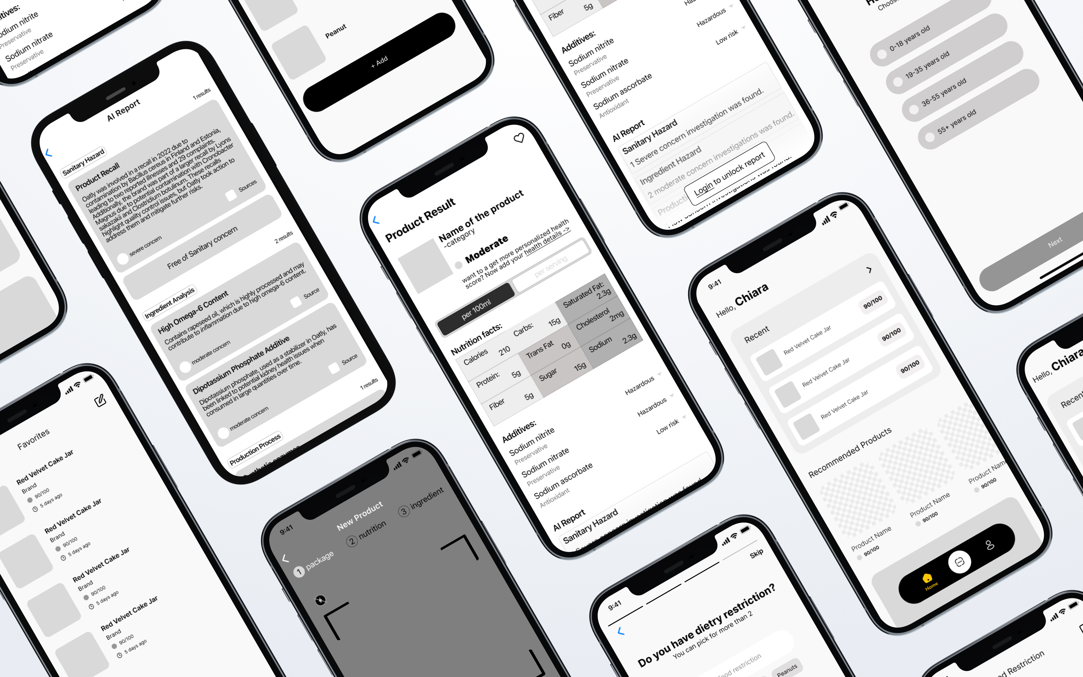
Wireframes & Iterations
During the design process for PlanT, we conducted user testing with both stakeholders and potential users to gather feedback on the wireframes and prototypes. This helped identify pain points in the user flow and areas where the platform could be more intuitive. Based on the feedback, we refined the wireframes, adjusting layouts, simplifying navigation, and improving key interactions to enhance usability. The testing allowed us to validate the design decisions and ensure that the final product would meet user needs effectively, resulting in a smoother and more efficient user experience.
Components & branding

Bugbash and issue tracking
Alpha and Beta Testing
As we moved into the alpha and beta phases, the design team conducted rigorous quality assurance tests, identifying bugs and errors. We used Jira to track progress and collaborate effectively with the developers. By the time we reached the final presentation, all major issues had been addressed, and the platform was ready for launch.

Final Wireframes

